The Art Director's Moodboard Workflow (Used by 100+ Studios)
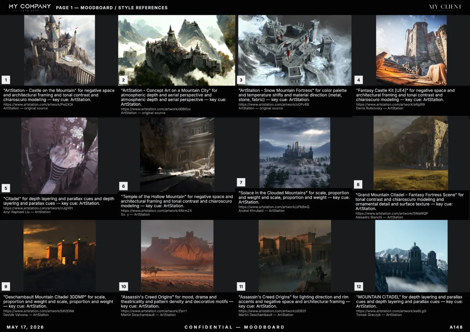
Art direction lives or dies on the first moodboard. This is the workflow we see in the best studios — agencies, in-house brand teams, and independent creative directors — for shipping moodboards that make the brief crystal clear and survive seven rounds of revisions.
Step 1 — Translate the brief into three keywords
Before opening any tool, distill the brief into three controllable axes: subject (what is shown), mood (what it feels like), medium (how it was captured). If you can't write all three in one sentence, the brief is not ready.
Step 2 — Build a generation prompt, not a description
An AI moodboard creator rewards prompts that read like a camera report. Specify era, lens, lighting, palette, and an exclusion list. This is the difference between 60% usable references and 95%.
Step 3 — Lock the palette before the layout
Decide on 4–6 hues — primary, secondary, accent, two neutrals — and lock them in your moodboard tool. Every subsequent regeneration should respect the palette. This produces boards that read as one direction, not a Pinterest collage.
Step 4 — Use a studio template for every client
Header logo, footer with client name and date, consistent grid. RefMood's template system stores these per client, so a junior designer can ship a board that looks senior.
Step 5 — Annotate, don't decorate
Each tile gets one short caption explaining why it's on the board: "color logic", "texture", "framing". Without captions, the client argues about images. With captions, they argue about ideas.
Step 6 — Export in three formats
- PDF for the deck.
- Figma frames for the design team.
- PNG sheets for Slack and WhatsApp previews.
Naming conventions that scale
CLIENT_PROJECT_v01_DIRECTION-A.pdf. Add a numeric version on every export, even drafts. You will thank yourself in week three.
The metric that matters
Not "is the board pretty?" but "can the team produce work in this direction without asking the AD again?" A great moodboard is a self-serve brief.
FAQ
How many references should a moodboard have?
12 to 24 hero tiles, plus a palette strip and a typography swatch. More than 30 dilutes the direction.
Should I show one direction or three?
For pitches: three labelled directions. For execution: one locked direction with sub-boards per scene or asset.